Wednesday, November 8, 2017

each logo has a history

the history of xerox. and all the changes merely reflect the development ton the company from the late 1940s analog beginnings to the iconic 1961 chermayeff and geismar logo to the 1994 landor pixelated "X," to xeros's present incarnation. the lesson is that no logo can take care of all the possible instantiations in the development of a company -that is, unless the company purposefully intends to keep that identity. my favorite? C&G!
if you care for logo design history? check this site.
Wednesday, November 1, 2017
Neo-Surrealism: Boris Hoppek's depiction of women: objectification or liberation?

Hoppek's latex-pussy project. Is it an expression of female objectification or liberation? there's objectification no doubt, but he's playing it too obviously, which makes for a calmer critique. what i'm saying is that hoppek is debating a male POV (what else, that's what he is) of what objectification is, but objectification was never defined by men, but by women. "felt" by women not by men.

assemblage above, Magritte-like

a crueler Magrittean version

Monday, October 16, 2017
your turn No. 5

Otto Dix, War Cripples, New Objectivity, 1923
Dear class. After hours of careful work over the weekend preparing interesting legends for each image in your list for the midterm, my blog page froze and I lost the whole lot (I couln't believe I had not saved it). I have to do it again and will have it ready for this afternoon (Monday). In the meantime, this is the post for this week's class.
There is so much to talk about: Futurism, Synthetic Cubism, Suprematism, Constructivism, New Objectivity, New Typography, Dada... wow.
Pick your theme and stick to the idea of graphic design.
Wednesday, October 4, 2017
your turn #4

Plenty to talk about last class.
First the personalities: Cheret, Beardsley, Mucha, McDonald, Pizarro, Schmidt- Rottluff, Paul Klee, Adolf Loos, etc.
Stylistic influences: the difference between Arts and Crafts and Victorian and the difference between the latter and Nouveau. The Viennese Secession, van de Velde, The Beggarstaffs, Gesamtkunstwerk, Werkbund, etc.
Your comments are getting better, keep it on.
Wednesday, September 27, 2017
your turn #3

The Crystal Palace, 1854, (the symbol of Victorian design)
class: take a look at this link for typeface development from 15th to 19th century.
Let me summarize a bit: We had to move fast, so there is plenty to comment about typeface development: from Gutenberg to Jenson to Manutius, Griffo, Caslon, Baskerville, Didot (influenced by Baskerville), Bodoni, and Morris, etc. it's a very interesting story of design influenced by climate, language and culture, and by "culture" I mean religion, politics, ideas, etc. In the end you could see it as a struggle between north and south, Humanism, vs. Conservatism, Protestantism vs. Catholicism, etc.
There are graphic design highlights: 1. newspapers, 2. magazines, 3. the advent of "community of interests" (gardening, mechanics, children's books, music printing, postcards), 4. 19th century posters: fairs, circus, night life in general, etc.
In terms of technological development we had: the advent of photography and how it changes how culture sees itself: landscape photography, portraiture, natural science, war reportage, anthropology (Talbot's Pencil of Nature), etc.
In terms of movement we briefly talked about Romanticism, Victorian design (by the way forgot to talk about this), Arts and Crafts (Ruskin, Morris, Crane), The Pre Raphaelite Brotherhood movement and (I owe you Decadence, Oscar Wilde and Art Nouveau).
I need the class to make comments (they constitute 20% of the final grade). Also, try to make your comments more relevant to what we're discussing.
Wednesday, August 23, 2017
your turn #1

dear class. we've covered thousands of years of history in our first class: pre-alphabet, cave marks, rock marks, alphabet, neolithic marks, cuneiform, hieroglyphics, the mark as physical (column, chair, wheel, etc), colossal marks, political, symbols from nature, from animals, various codexes... the point that anything is a mark.
either you can post your comment using a google account, open ID, or anonymously.
what is important is that after your comment you sign with your actual name as it appears on my roll.
either you can post your comment using a google account, open ID, or anonymously.
what is important is that after your comment you sign with your actual name as it appears on my roll.
there is really no blueprint for comments. say anything you want -as long as it relates with our first discussion. I'd advice that you write your comment in Word and then copy and paste it here, since sometimes after you click "post a comment" the comment may get lost.
try to make your comment relevant. think about what you want to say. of course, you can go off an tangent -if you find it relevant.
remember a minimum of 150 words. i will close this post next wednesday at 2pm.
go ahead!
try to make your comment relevant. think about what you want to say. of course, you can go off an tangent -if you find it relevant.
remember a minimum of 150 words. i will close this post next wednesday at 2pm.
go ahead!
Monday, December 5, 2016
Sunday, November 13, 2016
your turn #8
(above the pitch of Saul Bass to ATT for its logo redesign -watch and learn)
there's plenty to discuss: Lubalin, symbol signage, Stankowski's metadesign, Swiss Topography Style, advertising, propaganda, Bass film title design, Alvin Lustig, pre logo, logo, the logo masters: Rand, Bass, Chermayeff & Geismar.
go ahead,
Saturday, November 5, 2016
your turn #7

alexander liberman, vogue, 1950
we took a sweep at graphic design in between the wars: the liberatyed woman of the roaring 20's, the suffragist backlash. the stars of european graphic design: a.m. cassandre, lester beal, joseph binder, agha, liberman, mcnight kauffer, piet zmart, herbert matter, alex brodovith, the design force of neoplasticism, surrealism in cinema, poster goes to war, normal rockwell, margaret bourke white's photos, public health design, informational analysis design, design reportage...
a lot to process. pick your favorite.
Thursday, November 3, 2016
Saturday, October 29, 2016
your turn #6

Magritte, The Threatened Assassin, 1926
we had to go very fast, to cover thirty years of 20th century avant-garde:
deutscher werkbund, blue rider, expressionism (woodcut, film, graphic design, architecture), neue sachlichkeit circa 1926 (grosz, dix), cubism (analytic, synthetic, collage!), dada (political, metaphysic), futurism (music, graphic design, architecture), die neue typographie (tschichold), russian futurism, malevich geometric abstraction, russian constructivism (film, theater, architecture), rodchenko, lissitsky. BAUHAUS (pottery, architecture, textiles, theater, furniture, etc), surrealism (film, graphic design, photo).
keep in mid graphic design,
go ahead.
Thursday, October 27, 2016
sorry, forgot about Jan Tschichold


Tschichold's background is in calligraphy, which sets him apart from almost all other noted typographers of the time (since many of them were architects). he became a leading advocate of modernist design: first with an influential 1925 magazine supplement; then a 1927 personal exhibition; then with his most noted work Die neue Typographie.
1- tschichold condemned all fonts except sans-serif (called 'Grotesk' in Germany).
2- non-centered design (e.g., on title pages.
3- standardized paper sizes for all printed matter, and
4- effective use of different sizes and weights of type in order to quickly and easily convey information.
Thursday, October 20, 2016
"I will reveal to you with words that are simple" -- Mayakovsky

As they say,"the incident is closed."The love boat wrecked by daily life.
I'm all even with life and nothing would be gained by listing
mutual hurts, troubles, and insults.. . . .
Don't think I'm a coward. Seriously, it could not be helped (Mayakovsky's suicide note).
Wednesday, October 5, 2016
Friday, September 30, 2016
Thursday, September 29, 2016
the art of mystery: max klinger's illustrations

Max Klinger was born in Leipzig and studied in Karlsruhe. An admirer of the etchings of Menzel and Goya, he shortly became a skilled and influential engraver in his own right. Klinger traveled extensively around the art centers of Europe for years before returning to Leipzig. From 1897 he mostly concentrated on sculpture. Klinger was cited by many artists (notably de Chirico, as being a major link between the Symbolist movement of the 19th century and the start of the metaphysical and Surrealist movements of the 20th century. Believe it or not, Klinger was a strong influence for one of my favorite photographers, Francesca Woodman.

Gesamtkunstwerk!
Here, the mysterious story of the glove.

Gesamtkunstwerk!
Here, the mysterious story of the glove.
The Saturday Evening Post

Otto von Bismarck, by George Gibbs
From 1821 to 1969 The Saturday Evening Post published current events articles, editorials, human interest pieces, humor, illustrations, a letter column, poetry (including work written by readers), single-panel cartoons and stories.

It was known for commissioning lavish illustrations and original works of fiction. The illustrations were featured on the cover, and embedded in stories and advertising. Some Post illustrations became popular and continue to be reproduced, especially those by Norman Rockwell.

Jean Delville's artistic mystery
 |
| The Treasures of Satan, 1898. |
 |
| Portrait of Madame Stuart Merril, |
 |
| Delville's monumental Homme Dieu, 1895. |
Saturday, September 24, 2016
your turn #5

Brad Holland, Junkie, 1972
this is a great moment in history for the graphic arts: children's books, calendars, cards, comics, puck, chromolithography, gibson, nast, pre-raphaelites, reception, morris, the idea of gesamtkunstwerk, victorian design vs. arts and crafts, a bunch of figures: millais, gaudy, pisarro, mckmurdo, madox brown, grasset, beardsley.
go ahead!
Thursday, September 22, 2016
Rudolph Koch (the northern influence)


Rudolph Koch was for most of his career the staff designer at the Klingspor type foundry in Offenbach. Early work by Peter Behrens and Otto Eckmann showed a clear Jugendstil culture upon which he built, designing revised blackletter faces. He combined the talents of punch cutter and calligrapher, two skills sometimes at odds with each other (above Koch various specimens).
Some of Koch well known fonts.
Here a list of Koch's "Christian symbols."
Some of Koch well known fonts.
Here a list of Koch's "Christian symbols."
Frederic W. Goudy

Born in Bloomington, Illinois in 1865, Frederic W. Goudy, was one of the most well known and prolific American type designers. Frederic Goudy is best known for his type-styles: Oldstyle, Kennerly, Garamond, Deepdone and Forum.
What do we see here?
Essentially Goudy took the notion of the private press typeface inaugurated by William Morris and extended it to the larger world of commerce. Kennerley, the typeface designed for The Door in the Wall by H.G. Wells (published by Mitchell Kennerley, 1911), was the turning point in his career, the moment when type design began to overtake lettering and private press printing as his principal activity.
how do you design "shopping"?

This one is fresh from the NY Times, a candid look at how corporations learn from human behavior:
The reason Target can snoop on our shopping habits is that, over the past two decades, the science of habit formation has become a major field of research in neurology and psychology departments at hundreds of major medical centers and universities, as well as inside extremely well financed corporate labs (...) One study from Duke University estimated that habits, rather than conscious decision-making, shape 45 percent of the choices we make every day, and recent discoveries have begun to change everything from the way we think about dieting to how doctors conceive treatments for anxiety, depression and addictions.And how corporations get into the habit forming business? It turns by making you believe you make the choice!
Didn't you know this already?“With the pregnancy products, though, we learned that some women react badly,” the executive said. “Then we started mixing in all these ads for things we knew pregnant women would never buy, so the baby ads looked random. We’d put an ad for a lawn mower next to diapers. We’d put a coupon for wineglasses next to infant clothes. That way, it looked like all the products were chosen by chance. “And we found out that as long as a pregnant woman thinks she hasn’t been spied on, she’ll use the coupons. She just assumes that everyone else on her block got the same mailer for diapers and cribs. As long as we don’t spook her, it works.”

I see it differently. Though they play the paternalistic game, corporations understand that we live in bad faith, (they mine on it and, by default, get us in the end).
Being a "consumer" means pretending independence.
Let's look again at this cycle of consumer's bad faith: You know you are being spied on, so you choose to play a game of "consumer independence," falling for the pretense that this time it's your choice?? (not the corporation's?). Bunk.
with the growth of the advertising industry, graphic art became an integral part of the way products reach consumers

the freedom of bicycling interpreted by georges massias as a fantasy
designing the calendar, circa 1885

Sunday, September 18, 2016
yout turn #4

take this famous illustration by g. doré entitled the neophyte. the young, next to the decrepit, there's so much here to mine!
what's on your mind?
lots to talk about: doré, romanticism again, early photography and its developments, daguerreotype, pictorialism, freaks, circus, 19th century typefaces, newspapers and its development, magazines and its development, political satire.
go ahead!
Thursday, September 15, 2016
the design of the freak (popular entertainment at the fringe of normality)
 |
| a 26-month-old hairy baby was one of the attractions on show at the freak circuses around the mid-1800s in New York |
 |
| four-legged myrtle corbin. presumably she had two sets of female genitalia |
 |
| Eddie Masher, "the skeleton dude" |
 |
| 'Big-footed' Fanny Mills |
 |
| Anne Leek, the armless lady, joined a freak show to earn a living |
 |
| charles ctratton, the dwarf "general tom thumb" |
my point is that "freak" is a "design" for the masses. part entertainment, part exotic, part wondrous, at the fringes of admissible and the society of the normal. as instrumentalized as they were, these creatures were admired, a social phenomenon which played in both directions.
the designer/illustrator goes to war

During the 1860's war reporting galvanized journalism, and the call for graphic designers offered opportunity for young artists to acquire experience in the high-pressure, short-deadline world of publishing. Homer's composition reveals the narrative conventions of his day. The emotional impact of his drawings derives from Homer's choice of the moment to be represented with all that it implies about the events preceding an d following it.
Photo in-motion: Eadweard Muybridge

Eadweard Muybridge started his reputation in 1867, with photos of Yosemite and San Francisco and became famous for his landscape photographs, which showed the grandeur and expansiveness of the West. The images were published under the pseudonym “Helios.”
Muybridge helped solve the riddle of the horse's gallop.

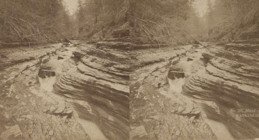
early underwater photography??

underwater photography (1893)

louis boutan is the first underwater photographer (via professor eliot)
Subscribe to:
Posts (Atom)