Thursday, April 24, 2014
redesigning parking

 parking lots are urban wastelands of asphalt, but there is a solution: implementing solar panels in car parking lots to keep regular cars cool and in some cases to charge electronic vehicles. at about 4 meters high each 'tree' is topped-off with a canopy covered in solar cells.
redesigning coastal development
the impacts of climate change are likely to worsen many problems that coastal areas already face. shoreline erosion, coastal flooding, and water pollution affect man-made infrastructure and coastal ecosystems. confronting existing challenges is already a concern. addressing the additional stress of climate change may require new approaches to managing land, water, waste, and ecosystems.
designing food
food deserts: 2.3 million americans live more than one mile from a supermarket and do not have access to a vehicle. the report also notes that minorities and lower-income communities are often affected, as “urban core areas with limited food access are characterized by higher levels of racial segregation and greater income inequality.” it is not uncommon to go into these communities and the only food outlets found are fast food restaurants and convenience stores stocked with products that are highly processed and genetically modified – both characteristics that contribute to poor health and environmental degradation. food deserts have been a major contributor to obesity and other related health problems in these communities.
designing transhumanism
a list of 10 transhuman technologies happening or relatively soon in the horizon.
nothing against technology. but transhumanism embraces technology unproblematically. designing transhumanism demands a careful balance between the liberating potential of technology with the moral consequences of an unchecked optimism.
other possible outcomes: the idea of reprogenetics to alter people's IQ. also, the idea of technologies for human enhancement.
Saturday, April 19, 2014
your turn #9
 |
| nate waldon for adbusters |
a long list of emergent designers from the 2000's (under 30) and mid-career star designers. the common thread of the work is the modularity & malleability of the mark, whether 1D, 2D or 3D.
in our post-human era, typeface becomes font, elevation, furniture, building, installation, environment, even data/structure.
what's in your mind?
below, find our topics-for-the-final. also don't forget your teacher evaluations!
Thursday, April 17, 2014
Friends with You (originally from Miami now in LA)
Friends with You is a company from Miami.
Established in 2002 by Miami-based artists Samuel Borkson and Arturo Sandoval III, FriendsWithYou set forth on a mission to spread the idea of Magic, Luck, and Friendship™ around the world, and become Friends-With-You!
Designed as a resource center for all things creative, FriendsWithYou is a unique think-tank that has the ability to seamlessly incorporate their distinct artistic style and one-of-a-kind ideas into a wide range of mediums and applications. FriendsWithYou’s work spans all creative realms from fine art to large-scale experiential installations and interactive events to public playgrounds, directorial work, live performances, animation and multimedia projects, branding and licensing. All FriendsWithYou projects offer once in a lifetime experiences, as FriendsWithYou is in a category of its own as a first class multidisciplinary art collective and creative studio (from FwY website).
LUST
There is no other conceptual studio in The Netherlands where conceptual thinking about graphic design and cutting edge digital technology are as obviously interdependent as they are at LUST. Its members describe themselves and their select group of like-minded designers as Generation Random. What means that every piece conceived by LUST has an element that is randomly generated. Each job is seen as an incentive to research and question the strategies and workings of design itself.
LUSTlab researches, generates hypotheses and makes unstable media stable again. The future of digital media lies in the design of its use. Humanizing the unhuman, bringing the internet down to earth and finding the missing link between the digital and the physical. The outcomes vary from (strategic) visions to new communication tools, man-machine installations and physical products using digital content.
Enter LUST.
TOKO
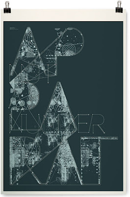


• When did you get started?
Toko was established in 2001 in Rotterdam, The Netherlands, and is now operating out of Surry Hills, Sydney, where it relocated in the beginning of 2006 to pursuit new (geo)graphic adventures.
• What about the name?
The name Toko has a strong Dutch-Asian historical background and is common Dutch slang for "shop".
• What do you do?
Toko is a multidisciplinary design studio with the emphasis on print design.
What more do we do; signage and environmental graphics, editorial, book and magazine design, identity and concept design, poster, flyer and invitation design, music and fashion related design and more...
• How can you describe your intervention area?
We would like to maintain our intervention area as broad as possible because every field has it's own unique set of opportunities for interesting and challenging outcomes.
• What place does typography take into your work?
Typography plays a significant role in our work. If possible we like to experiment with it or create an unique typeface per project. Typography is much more then just getting information across.
• Favorite cocktail?
The mix of creativity and a down to earth approach.
(Taken from TOKO's Website)
(TOKO's "CODE" above, for Final Exam).
Saturday, April 12, 2014
your turn #8
 |
| art by dogboy |
george lois, chermayeff & geismar, LOGO, bass' lesson, ed fella, jamie reid, PUNK, david carson's revolution, the 2000's: sgameister, chris ware, eboy, ellery, barnbrook, shaoua, opara, bodkin, fanelli...
Thursday, April 10, 2014
2x4
New York-based design firm 2x4 is credited with helping to redefine graphic design as one of the most inclusive and visible design categories. 2x4's sophisticated approach emphasizes critical thinking and research, and its projects encompass virtually all graphic media — print, motion graphics, and environmental design. The studio's design solutions are visually rewarding, employing rich but unexpected combinations of image, color, and pattern in work that is avant-garde yet rooted in the context of its subject matter. This exhibition illustrates the range of 2x4's design activity through books, custom wallpaper, and video experiences representing projects for clients as diverse as the Brooklyn Museum, KnollTextiles, and Prada (taken from SFMOMA). Michael Rock, principal of 2x4 is a winner of the National Design Award.
Imaginary Forces

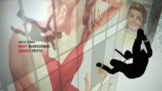

Imaginary Forces: We research, we write, we draw, we design, we paint, we photograph, we sculpt, we program, we talk, we argue, we collaborate, we pitch, we imagine. What do we make? Film titles. Commercials. Interactive spaces. Television. Live action. Broadcast design. Virtual destinations. Experience Design. Graphics. Branding. The list goes on. Regardless of the project, though, we always want to tell a story. Simple or complicated, it doesn't matter. Whether it be a main title or a journey through an immersive architectural environment, complete with audio, video, giant puppets and acrobats - the story needs to be compelling and relevant. And however we need to tell it, we will (from Imaginary Forces' Website).
everything comes to an end: rise and fall of grunge
Hop on the nostalgia train for a second. Think back to the 90s. To Nirvana, Linklater’s Slacker, and the flannel-clad rebels on the run from the 80s. To skateboards and graffiti and toe rings and VHS tapes. Things were messy then. And type design was messy, too. Words were splayed and chaotic, letters blurred. Textures were thick and heavy. Concert posters looked like someone had splattered paint on paper and then scratched out band names. You may have noticed it, you may not have, but at its peak, this typography style, called grunge, was ubiquitous. Alternative music cds, videogames, and zines—all the aggregate products of a wayward generation—appropriated its unfinished and frenzied aesthetic, and it became the largest, most cohesive movement in recent font design history. It was everywhere—
and then it wasn't.
Corporate Design
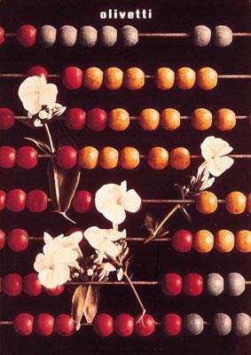

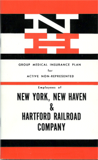
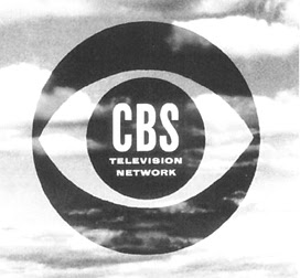
In general, this amounts to a logo (logotype and/or logogram) and supporting devices commonly assembled within a set of guidelines.
How the identity is applied and confirm approved color palettes, typefaces, page layouts and other such methods of maintaining visual continuity and brand recognition across all physical manifestations of the brand.
Corporations have, need identity to run through all of their products and merchandise. Identity is the very SELF of the corporation.
LOGO is a superobject, the future, the becoming of this corporation. LOGO is a soul.
Above: The CBS logo, by William Golden; The New York, New Haven and Hartford Railroad trademark by Herbet Matter; IBM by Paul Rand and Olivetti by Italian designer Giovanni Pintori.
Paul Rand book and then logo (as branding)
Paul Rand (1914-) is one of the most influential figures in American graphic design. He explored the formal vocabulary of the European avant-garde art movements and developed an unique and distinctly American graphic style which was characterized by simplicity, wit and a rational approach to problem solving.
Educated in New York at Pratt Institute from 1929-1932, Parson's School of Design from 1932-1933 and the Art Student's League from 1933-1934, Rand was a major force in editorial design. He was art director of Esquire and Apparel Arts (later GQ: Gentleman's Quarterly) from 1935-1941 and designed covers for the Directions cultural journal between 1938 and 1945.
Friday, April 4, 2014
your turn #7
Thursday, April 3, 2014
Wasilewski Mieczyslaw
Sunday, March 30, 2014
your turn #6
 | |
| stein brianhoff |
the emigrés: zwart, pineles, bass, lubalin, cassandre. mondrian & de stijl, 1940's women's lib: jenny on the job, etc.
Thursday, March 27, 2014
Wednesday, March 26, 2014
what's borderland?
hi class. FYI: our own, arh 346's leah brown, has her MFA show up. she got a nice review in the the miami new times.
My process is very much about trying to get a philosophical or scientific understanding of dreaming through the examination of my own dreams. Dreaming is really kind of lost on science right now, it's something that's very much unexplained, and yet it's something that we each do every night, regardless of how much we remember. I think it's kind of a borderland, and that's why I called the show 'Borderland' - it's this area between something that is real and something that is not real."it sounds interesting, it looks good.
i plan to go see it. you should, if you can.
Friday, March 21, 2014
your turn #5
expressionism, dada, surrealism, constructivism's color "filters," the lesson of BAUHAUS, neue typographie, "marks" as art, propaganda vs. advertisement, photomontage, lissitsky, tshichold, Die Wissenhoffsiedlung, the total designer: beal, binder, brodovitch, matter, graphic design as art, etc, etc,
what's on your mind?
Thursday, March 20, 2014
el lissitzky


lissitzky's entire career was laced with the belief that the artist could be an agent for change, later summarized with his edict, "zielbewußte Schaffen" (goal-oriented creation). he began his career illustrating yiddish children's books in an effort to promote jewish culture in russia, a country that was undergoing massive change at the time and that had just repealed its anti-semitic laws.
over the years, he taught in a variety of positions, schools, and artistic media, spreading and exchanging ideas. he worked with malevich in heading the suprematist art group UNOVIS, when he developed a variant suprematist series of his own. in 1921 he took up a job as the russian cultural ambassador to weimar germany, working with and influencing important figures of the bauhaus.
some works by lissitzky.
Thursday, March 6, 2014
Moving posters: Man With a Movie Camera
Vertov's Man With a Movie Camera was produced by the Ukrainian film studio VUFKU. It presents urban life in Ukraine and other Soviet cities. From dawn to dusk Soviet citizens are shown at work and at play, and interacting with the machinery of modern life. The film is famous for the range of cinematic techniques Vertov invented, deployed or developed, such as double exposure, fast motion, slow motion, freeze frames, jump cuts, split screens, Dutch angles, extreme close-ups, tracking shots, footage played backwards, animations, and a self-reflexive style (at one point it features a split screen tracking shot; the sides have opposite Dutch angles (WKPD).
Art for the people?

Vladimir Tatlin achieved fame as the architect who designed the huge Monument to the Third International, also known as Tatlin's Tower. Planned in 1920, the monument, was to be a tall tower in iron, glass and steel which would have dwarfed the Eiffel Tower (it was a third taller at 1,300 feet high). Inside the iron-and-steel structure of twin spirals, the design envisaged three building blocks, covered with glass windows, which would rotate at different speeds (the first one, a cube, once a year; the second one, a pyramid, once a month; the third one, a cylinder, once a day). High prices prevented Tatlin from executing the plan, and no building such as this was erected in his day.
Subscribe to:
Comments (Atom)


