Friday, September 30, 2016
Thursday, September 29, 2016
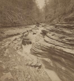
the art of mystery: max klinger's illustrations

Max Klinger was born in Leipzig and studied in Karlsruhe. An admirer of the etchings of Menzel and Goya, he shortly became a skilled and influential engraver in his own right. Klinger traveled extensively around the art centers of Europe for years before returning to Leipzig. From 1897 he mostly concentrated on sculpture. Klinger was cited by many artists (notably de Chirico, as being a major link between the Symbolist movement of the 19th century and the start of the metaphysical and Surrealist movements of the 20th century. Believe it or not, Klinger was a strong influence for one of my favorite photographers, Francesca Woodman.

Gesamtkunstwerk!
Here, the mysterious story of the glove.

Gesamtkunstwerk!
Here, the mysterious story of the glove.
The Saturday Evening Post

Otto von Bismarck, by George Gibbs
From 1821 to 1969 The Saturday Evening Post published current events articles, editorials, human interest pieces, humor, illustrations, a letter column, poetry (including work written by readers), single-panel cartoons and stories.

It was known for commissioning lavish illustrations and original works of fiction. The illustrations were featured on the cover, and embedded in stories and advertising. Some Post illustrations became popular and continue to be reproduced, especially those by Norman Rockwell.

Jean Delville's artistic mystery
 |
| The Treasures of Satan, 1898. |
 |
| Portrait of Madame Stuart Merril, |
 |
| Delville's monumental Homme Dieu, 1895. |
Saturday, September 24, 2016
your turn #5

Brad Holland, Junkie, 1972
this is a great moment in history for the graphic arts: children's books, calendars, cards, comics, puck, chromolithography, gibson, nast, pre-raphaelites, reception, morris, the idea of gesamtkunstwerk, victorian design vs. arts and crafts, a bunch of figures: millais, gaudy, pisarro, mckmurdo, madox brown, grasset, beardsley.
go ahead!
Thursday, September 22, 2016
Rudolph Koch (the northern influence)


Rudolph Koch was for most of his career the staff designer at the Klingspor type foundry in Offenbach. Early work by Peter Behrens and Otto Eckmann showed a clear Jugendstil culture upon which he built, designing revised blackletter faces. He combined the talents of punch cutter and calligrapher, two skills sometimes at odds with each other (above Koch various specimens).
Some of Koch well known fonts.
Here a list of Koch's "Christian symbols."
Some of Koch well known fonts.
Here a list of Koch's "Christian symbols."
Frederic W. Goudy

Born in Bloomington, Illinois in 1865, Frederic W. Goudy, was one of the most well known and prolific American type designers. Frederic Goudy is best known for his type-styles: Oldstyle, Kennerly, Garamond, Deepdone and Forum.
What do we see here?
Essentially Goudy took the notion of the private press typeface inaugurated by William Morris and extended it to the larger world of commerce. Kennerley, the typeface designed for The Door in the Wall by H.G. Wells (published by Mitchell Kennerley, 1911), was the turning point in his career, the moment when type design began to overtake lettering and private press printing as his principal activity.
how do you design "shopping"?

This one is fresh from the NY Times, a candid look at how corporations learn from human behavior:
The reason Target can snoop on our shopping habits is that, over the past two decades, the science of habit formation has become a major field of research in neurology and psychology departments at hundreds of major medical centers and universities, as well as inside extremely well financed corporate labs (...) One study from Duke University estimated that habits, rather than conscious decision-making, shape 45 percent of the choices we make every day, and recent discoveries have begun to change everything from the way we think about dieting to how doctors conceive treatments for anxiety, depression and addictions.And how corporations get into the habit forming business? It turns by making you believe you make the choice!
Didn't you know this already?“With the pregnancy products, though, we learned that some women react badly,” the executive said. “Then we started mixing in all these ads for things we knew pregnant women would never buy, so the baby ads looked random. We’d put an ad for a lawn mower next to diapers. We’d put a coupon for wineglasses next to infant clothes. That way, it looked like all the products were chosen by chance. “And we found out that as long as a pregnant woman thinks she hasn’t been spied on, she’ll use the coupons. She just assumes that everyone else on her block got the same mailer for diapers and cribs. As long as we don’t spook her, it works.”

I see it differently. Though they play the paternalistic game, corporations understand that we live in bad faith, (they mine on it and, by default, get us in the end).
Being a "consumer" means pretending independence.
Let's look again at this cycle of consumer's bad faith: You know you are being spied on, so you choose to play a game of "consumer independence," falling for the pretense that this time it's your choice?? (not the corporation's?). Bunk.
with the growth of the advertising industry, graphic art became an integral part of the way products reach consumers

the freedom of bicycling interpreted by georges massias as a fantasy
designing the calendar, circa 1885

Sunday, September 18, 2016
yout turn #4

take this famous illustration by g. doré entitled the neophyte. the young, next to the decrepit, there's so much here to mine!
what's on your mind?
lots to talk about: doré, romanticism again, early photography and its developments, daguerreotype, pictorialism, freaks, circus, 19th century typefaces, newspapers and its development, magazines and its development, political satire.
go ahead!
Thursday, September 15, 2016
the design of the freak (popular entertainment at the fringe of normality)
 |
| a 26-month-old hairy baby was one of the attractions on show at the freak circuses around the mid-1800s in New York |
 |
| four-legged myrtle corbin. presumably she had two sets of female genitalia |
 |
| Eddie Masher, "the skeleton dude" |
 |
| 'Big-footed' Fanny Mills |
 |
| Anne Leek, the armless lady, joined a freak show to earn a living |
 |
| charles ctratton, the dwarf "general tom thumb" |
my point is that "freak" is a "design" for the masses. part entertainment, part exotic, part wondrous, at the fringes of admissible and the society of the normal. as instrumentalized as they were, these creatures were admired, a social phenomenon which played in both directions.
the designer/illustrator goes to war

During the 1860's war reporting galvanized journalism, and the call for graphic designers offered opportunity for young artists to acquire experience in the high-pressure, short-deadline world of publishing. Homer's composition reveals the narrative conventions of his day. The emotional impact of his drawings derives from Homer's choice of the moment to be represented with all that it implies about the events preceding an d following it.
Photo in-motion: Eadweard Muybridge

Eadweard Muybridge started his reputation in 1867, with photos of Yosemite and San Francisco and became famous for his landscape photographs, which showed the grandeur and expansiveness of the West. The images were published under the pseudonym “Helios.”
Muybridge helped solve the riddle of the horse's gallop.

early underwater photography??

underwater photography (1893)

louis boutan is the first underwater photographer (via professor eliot)
photograpy as naturalism (by niepce)

joseph niepce's first photograph from nature (1826)
first there is heliography. what is it?
... during his trials with lithography, Niepce experimented with light-sensitive varnishes and then with images produced in camera, but he was unable to prevent the images from fading. Niépce discovered that he produced his best results while using a solution of bitumen of Judea, which dated back to the ancient Egyptians but continued to be used for making lithographic engravings in the 1800s.then comes, photography:
In 1822, Niépce successfully made a heliograph from an engraving of Pope Pius VII, which was destroyed during an attempt to copy it some years later. Over the next few years, Niépce experimented with bitumen on pewter or zinc plates that could be inked for printing. His best results came in 1826 with the copying of an engraving of the Cardinal Georges d'Amboise in which Niépce invented the first successful form of photomechanical reproduction.
photo as portrait (not the selfie)
 at this early stage photography is the non-selfie. photography means to capture the world.
the magazine (for the working class)

the Penny Magazine, published every saturday from 1832 to 1845, was an illustrated british magazine aimed at the working class. though initially very successful—with a circulation of 200,000 in the first year—it proved too whiggish to appeal to such audience.

Friday, September 9, 2016
your turn #3

found this and reminded my of vesalius' de corpore fabrica, right? this is nunzio paci.
hi kids: as you can see, i was able to fix our blog a little bit. it will get better.
there's plenty to comment on, pick your favorite subject: incunabula, gutenberg's printing revolution, maps, bible translations, baskerville, caslon, blake, romantic imagery...
below there are seven posts i couldn't discuss with you because our website's glitch: bembo, imagines morti, garamond and geoffroy tory. take a look at them. remember i said that roman typeface comes back?
ok, go ahead!
Thursday, September 8, 2016
Google's Modern Atlas
 | ||
| Localized coloration in the roadways of Tokyo, London, & Paris. See late-afternoon shadows cast across San Francisco's Pioneer Park |
Google Maps & how it plans to design the Modern Atlas.
 |
| A sample of Google extensive icon system |
Google Transit has an archive of more than 475 cities all over the world!
Friday, September 2, 2016
your turn #2 (please, read my summary & you'll be fine)

after we finished last night, i felt i owed you a summary.
there are two main points to keep in mind about last class: how the mark evolves culturally, and formally:
(I) how the mark evolves culturally (from roman times to high middle ages/renaissance)?
1- the emergence of literacy (more people read, "the more you read the more you read"). why do people read more? from 8th century a.d., we have new vernacular languages: old english, high german, iberian (spanish), regional italian, etc.
2- christianity spreads throughout europe and the bible is translated into the vernacular. we looked at examples of the codex (a book form, rather than a scroll), the hymnal (people sang along with their little copies), the book of hours (remember you carry this one with you at all times), illuminated manuscripts (to catechize children, didactic everyday moral teachings), ars moriendi, (the nearness of death because of the "great plague"), the middle ages erotica (a thriving underground genre), etc.
3- spread of knowledge, i.e., the university (look at the 67! universities in europe by the high middle ages). because of the influences of the universities we get:
4- spread of science (ratdolt's euclid's elements)
5- spread of humanism (this is a renaissance development)
(II) how the mark evolves formally? now we're looking at typeface itself (from trajan to gothic)

see the different decorative systems of the gothic? there is an equivalence between architectural and calligraphic developments, tracery = typeface
what spearheads typeface this evolution?
a- the influences of different languages, and b- the diversity of writing tasks reflected in majuscule and minuscule. majuscule for the church, government, minuscule for scholars, the literati, the secretariat, bankers, in other words: the emergent bourgeoisie. c- each change in the mark reflects cultural conventions.
let's take a look at development new roman to gothic. imagine an arrow of influences moving first from south to north and then back again from north to south. it takes 700 years!
south and east traveling to north and west (this is basically the movement of christianization to the north)
new roman (uncials and half uncials or majuscule) majuscule are the headings and titles. uncials are miniscule.
visigothic = greek and arabic
old english (anglo-saxon with a normand influence from france).
carolingian (latin, but ruling over franco-germans)
now see the arrow moving north to south (since 1500's the movement of the reformation from north to south)
gothic and all its variations:
textura, (gothic in netherlands & germany),
rotunda (gothic traveling south to spain, italy),
bastarda (gothic in england) and
cursiva (gothic in france, germany, england).
now, what's on your mind? say it.
Thursday, September 1, 2016
movable type technique (again)

In the standard process of making type,
1- a hard metal punch (made by punchcutting, with the letter carved back to front) is hammered into a softer copper bar, creating a matrix.
2- the matrix is then placed into a hand-held mold and a piece of type, or "sort", is cast by filling the mold with molten type-metal; this cools almost at once, and the resulting piece of type can be removed from the mold.
3- the matrix can be reused to create hundreds, or thousands, of identical sorts so that the same character appearing anywhere within the book will appear very uniform, giving rise, over time, to the development of distinct styles of typefaces or fonts.
4- after casting, the sorts are arranged into type-cases, and used to make up pages which are inked and printed, a procedure which can be repeated hundreds, or thousands, of times.
Subscribe to:
Posts (Atom)