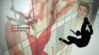
New York-based design firm 2x4 is credited with helping to redefine graphic design as one of the most inclusive and visible design categories. 2x4's sophisticated approach emphasizes critical thinking and research, and its projects encompass virtually all graphic media — print, motion graphics, and environmental design. The studio's design solutions are visually rewarding, employing rich but unexpected combinations of image, color, and pattern in work that is avant-garde yet rooted in the context of its subject matter. This exhibition illustrates the range of 2x4's design activity through books, custom wallpaper, and video experiences representing projects for clients as diverse as the Brooklyn Museum, KnollTextiles, and Prada (taken from SFMOMA). Michael Rock, principal of 2x4 is a winner of the National Design Award.
Thursday, April 10, 2014
2x4
New York-based design firm 2x4 is credited with helping to redefine graphic design as one of the most inclusive and visible design categories. 2x4's sophisticated approach emphasizes critical thinking and research, and its projects encompass virtually all graphic media — print, motion graphics, and environmental design. The studio's design solutions are visually rewarding, employing rich but unexpected combinations of image, color, and pattern in work that is avant-garde yet rooted in the context of its subject matter. This exhibition illustrates the range of 2x4's design activity through books, custom wallpaper, and video experiences representing projects for clients as diverse as the Brooklyn Museum, KnollTextiles, and Prada (taken from SFMOMA). Michael Rock, principal of 2x4 is a winner of the National Design Award.
Imaginary Forces


Imaginary Forces: We research, we write, we draw, we design, we paint, we photograph, we sculpt, we program, we talk, we argue, we collaborate, we pitch, we imagine. What do we make? Film titles. Commercials. Interactive spaces. Television. Live action. Broadcast design. Virtual destinations. Experience Design. Graphics. Branding. The list goes on. Regardless of the project, though, we always want to tell a story. Simple or complicated, it doesn't matter. Whether it be a main title or a journey through an immersive architectural environment, complete with audio, video, giant puppets and acrobats - the story needs to be compelling and relevant. And however we need to tell it, we will (from Imaginary Forces' Website).
everything comes to an end: rise and fall of grunge
Hop on the nostalgia train for a second. Think back to the 90s. To Nirvana, Linklater’s Slacker, and the flannel-clad rebels on the run from the 80s. To skateboards and graffiti and toe rings and VHS tapes. Things were messy then. And type design was messy, too. Words were splayed and chaotic, letters blurred. Textures were thick and heavy. Concert posters looked like someone had splattered paint on paper and then scratched out band names. You may have noticed it, you may not have, but at its peak, this typography style, called grunge, was ubiquitous. Alternative music cds, videogames, and zines—all the aggregate products of a wayward generation—appropriated its unfinished and frenzied aesthetic, and it became the largest, most cohesive movement in recent font design history. It was everywhere—
and then it wasn't.
Corporate Design


In general, this amounts to a logo (logotype and/or logogram) and supporting devices commonly assembled within a set of guidelines.
How the identity is applied and confirm approved color palettes, typefaces, page layouts and other such methods of maintaining visual continuity and brand recognition across all physical manifestations of the brand.
Corporations have, need identity to run through all of their products and merchandise. Identity is the very SELF of the corporation.
LOGO is a superobject, the future, the becoming of this corporation. LOGO is a soul.
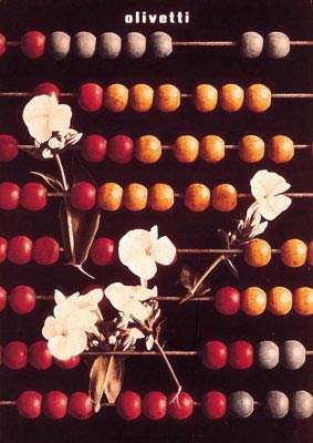
Above: The CBS logo, by William Golden; The New York, New Haven and Hartford Railroad trademark by Herbet Matter; IBM by Paul Rand and Olivetti by Italian designer Giovanni Pintori.
Paul Rand book and then logo (as branding)
Paul Rand (1914-) is one of the most influential figures in American graphic design. He explored the formal vocabulary of the European avant-garde art movements and developed an unique and distinctly American graphic style which was characterized by simplicity, wit and a rational approach to problem solving.
Educated in New York at Pratt Institute from 1929-1932, Parson's School of Design from 1932-1933 and the Art Student's League from 1933-1934, Rand was a major force in editorial design. He was art director of Esquire and Apparel Arts (later GQ: Gentleman's Quarterly) from 1935-1941 and designed covers for the Directions cultural journal between 1938 and 1945.


